Sunday, 16 October 2011

D is for...Davis, Alan Davis

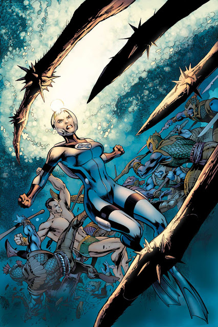
Terrifically dynamic cover made this book a must have for me before
I even knew my X-Men collection would go back this far.

I'm not sure if I first came across Alan Davis' work in a collection of Alan Moore's DR and Quinch while rifling through whatever could be found in my local library or in back issue hunting for X-Men and coming across his X-Men Annuals.  Nothing struck me too much about his work in either of those books though retrospectively they definitely have something I like.  As you might expect I've gone back to his great Detective Comics run with Mike Barr and Captain Britain with Alan Moore but my affair with Davis beganwith a shockingly ugly shiny covered 90s number one.
I think odd costume design and odd characters helped make ClanDestine as short lived
as it was.
My real first Alan Davis was his own creation ClanDestine.  Beginning collecting comics in earnest in '91 meant there was plenty to choose from.  Marvel and DC drowning the market along with Image but I lucked onto ClanDestine.
The book is extremely English and I think was never goning to take of.  Issue three featured a cameo with Spider-Man which is where I was hooked on Davis' always charming and slick style added by the equally slick Mark Farmer, his now long-time art partner following the very competent Paul Neary who'd inked him for the first chunk of his career.
The splash that got me hooked.  Nice!
I've heard that he's said to refute any real move towards Neal Adams style but I find it very hard that he expects us to believe that or that if it's subconcious he can't see it himself if.  His men are rugged and his women gorgeous, his panel layouts owe a lot to Adams too.  ClanDestine/X-Men even features some of Adams' panel compostions which together make up one image (below).
Pile of bones becomes androgeanous old lady hair becomes trees, a la Neal Adams
We got a brief overly coloured, pretty unreadable three issue Fantastic Four run before he went quiet for a little while and came back at DC with Justice League: The Nail, an Elseworlds hung on "What if the Kents had got a puncture and never found baby Superman".
Davis draws tonnes of characters interestingly as well as Golden or Art Adams

Davis' writing is always super dense but always so earnest that I find while I generally need a bit of a mental run up to read it, I always enjoy it.  The Nail was around 180 pages featuring Davis getting to draw every major character at  DC comics, the majority getting a one page splash to show off on a la Steve Ditko's Spider-Man Annual.

Davis came straight back to do a sequel with an uninspired title (Another Nail) but again showcasing great art.  It allowed him to spotlight all DC's weird 60s and 70s characters like the Creeper and Black Orchid with as much gusto as he'd shown to Batman and Green Lantern in the first.  Both solid books!
The Nail books set the precedent for what we would get from Davis going forward, a George Peréz style drive-through all his favourite bits of comics, drawing the characters he obviously has great affection for.  Fantastic Four: The End, Killraven, Avenger:Prime, Uncanny X-Men, Superboy's Legion (with Farmer wrting) all have this "get everyone in" approach which works largely because he draws everyone so well.
Davis continues at Marvel today doing special projects and covers for the most part, the next being a Cap America run with Ed Brubaker which I hope will be full of Modoks and weird Kirby Nazis.
His ability to draw almost any character (always something odd about his Wolverine and Hulk for me...) combined with great composition and great Farmer's super slick inks and ink effects makes his covers always worth a look.
Davis' own website here including pencils which hightlight Farmer's contribution to the work.
As always a smattering of images pilferred via a Google search: "Alan Davis Comic"


Homage to Davis' own Excalibur #1 from ClanDestine Vol 2
God, I loved this cover.  It would be years before I bought it just for the cover! (It's nice inside too!)

 
Davis keeps pulling out the spectacular!


Dynamic at a glance with horror upon closer inspection


Sunday, 9 October 2011

C is for...Cowboy Wally


Cowboy Wally was the second book I read by Kyle Baker.  Why I Hate Saturn was the first and I loved the banter between the characters, each character smarter than the last drawn in a style fast and loose with a wash thrown in to add some depth.  The book, first published in 1990, was already a couple of years old when I came to it.  I would later find out it had been Baker's second graphic novel done with with Baker's ever commercial eye on Hollywood pre-empting a trend which is rampant now.
Cowboy Wally, however, to me feels a lot more heartfelt.  Published on the back of the success of Maus and book publishers trying to be the first to put out new Graphic Novels, Baker bluffed his way in with a book about a fat alcoholic TV cowboy who, as the story develops, we discover managed to blackmail his way into TV and the various projects we learn about throught the course of the story.
The four faces of Wally
What particularly struck me about this versus any other given Baker book was the quality of his art.  At the time I hadn't read he and Andy Helfer's spectacular "could only happen in comics" run on the Shadow where the same style was used.  For the most part Baker hasn't gone back to it since (he has a massive range of influences including Jules Feiffer, Jack Kirby, Neal Adams, Wally Wood, Charles Schultz and he's not afraid to flex his muscles).  The style used in Cowboy Wally and The Shadow is an incredibly effective mix of exagerrated cartooning mixed with highly rendered inks and perfect shadows and light sources which results in the feeling of watching vintage black & white footage with a hyper real veneer.

Baker's comedy is spot on, largely black humour dense with sparkling wit but as opposed to every character being whip smart (as in Why I Hate Saturn), Wally himself is oaf, savvy enough to more than get by in life, surrounded by characters who struggle to resign themself to being in his orbit, suborbinate to this essentially disagreeable crook who gets the money and as many vacuous, stunning women as he wants.
The third, most memorable chapter of the book finds Wally and his unwitting (and of course far more book smart) sidekick Lenny in prison on a drunk and disorderly while under an obligation to make Hamlet, which they proceed to do in their cell with their cellmates of a more hardened variety.
The Cowboy Wally Show's focus on the  nature of empty celebrity is even more relevant now, over twenty years later and remains timeless thanks to an art style that is both backwards looking and hyper real and still very, very funny!
Baker has maintained a foot firmly in the comics world throughout his long career and is constantly evolving his style, an early adapter to any technology that will facilitate his work.  Inteviews with him show him as being very comercially minded and confident, far from a naval gazing auteur but his output ranges from Truth for Marvel showing how the US military tested their Captain America serum on black soldiers before risking it on whites to The Bakers, a slice of life family comedy strip, personal, but ready for syndicates at any given point.
While I don't want to say that "I liked his old stuff better" I am always ready for a return to pen and ink over digital work but it can never be said there's a dull moment if Baker's on a book and it's pretty much always worth a look.

You can dip into real living legend Kyle Baker's world here and currently find him at work on Deadpool Max with the excellent David Lapham.
Below various bits pilferred from a Google image search: "Cowboy Wally".


Sunday, 2 October 2011

B is for...Edvin Biuković

Back before the internet, when Wizard was required reading, they published a small article about a Croatian creative team who were going to work on one of Matt Wagner's Grendel Tales mini series.  The article explained how the story had been submitted almost fully formed and how they'd had to rush through contracts to prevent artist Biuković from been sent to war.
Batman/Grendel was the first time I'd seen Grendel and to this day remains one of my favourite Batman stories and is hands down my favourite work by the ever changing Wagner.
I'd originally been attracted to Grendel Tales because of Grendel prime which, although I was a pretty pleasant teenager, spoke to me fore being "Cool", "Dark" and "Edgy",  a case it turns out of liking the right things for the wrong reasons.  The eclectic early Grendel Tales artists Rob Walton and Paul Grist did nothing for me (I must stress, "at the time"!).  You had to pick them up though for the short painted back-ups by Wagner which were leading up to Batman/Grendel 2, the slightly disappointing sequel.

The two parter by Macan and Biuković changed everything for me.  Not since Batman Year One had I seen such acting, such emotion in a comic with not one misstep in the storytelling meaning it's only on rereading where it strikes you how notable the work is, carrying you through without any distracting mistakes.  The story is only nominally anything to do with Grendel and is clearly influenced by the conflict going on in Yugoslavia at the time with abstract leadership setting a nation to war with itself.
The story is that of a dying soldier, Drago, poisoned by the enemy's dirty weapons looking to die with honour while tribal politics try to stop him, his younger brother looking on.  The tribe's blind leader rules with the aid of his young son literally directing him (from up on his shoulders) until he sets up an epic betrayal.  In TWO issues!!!!
Spoiler.  One of the final scenes from the final chapter of Devils and Deaths
As good as the story is the characters are brought to life by Biuković's early, loose style with perfect pacing.
The pair returned after a break with a four part sequel which continued the story with Drago's younger brother Goran among an expanded cast and a larger scale.  The fact that this book is out of print is a flat out crime but if it can be found on Amazon etc, snap it up.  This was a book I sold hand over fist while working in the comic shop with a money back guarantee that was only ever used once, and he was just a contrary idiot.
(Before continuing I have to mention the handpainted colour by Matt Hollingsworth which was subtle and naturalistic, completing the package)

Biuković was apparently not great with deadlines so his Star Wars X-Wing Rogue Squadron series was finished by Gary Erkine which was respectable enough but Biuković was a tough act to follow and it falls a little flat.
One of the latter pagesof Last Command


He was given more time for the third volume of the Star Wars Thrawn Trilogy, The Last Command.
Olivier Vatine's first book was beautiful and stylised with hints of Simonson and Leialoha. The second book has Terry Dodson inked by Kevin Nowlan ending up as neither fish nor fowl with a fair ammount of heavy photo referencing resulting in a fairly flat experience.
Biuković turning up for the final series was very welcome although it wasn't the Biuković I was expecting.  I intially put the change in stlye down to Eric Shanower's inking on all but the first issue but upon hindsight that makes no sense at all (I was young).  The cleaner style turned out to be an evolution in style for Biuković.  He was moving towards a more fastidious style with no excess rendering, a less is more, no fuss style.  The acting, pacing, composition was still perfect with a couple of clunky pages but he was obviously investing more time in a slick finish that I don't think helped him get any faster.  You can't help but sense some Lucas involvement with likenesses.

Human Target Issue 2, Page one.  Ledge hanger more than Cliffhanger.
Biuković surfaced next at Vertigo on Peter Milligan's Human Target series, currently collected along with Javier Pulido's graphic novel (which I'd bet money was orignally meant to be a mini).
Biuković's staging of Milligan's script was absolutely perfect, with Milligan writing a taught, psychological thriller with heart and Watchmen style scene transitions which a lesser artist would not have been able to bring to life.  A perfect project for an artist walking so fine a line as a great comic storyteller with an eye very much on what cinematography can add.  Four issues of text book action comic storytelling.

 His next couple of stories were for Vertigo anthologies.  The first in Strange Adventures was a sci-fi strip by Bruce Jones with an ending that Biuković's consistent character designs couldn't help but signpost making for an anticlimactic twist ending.
His last strip had him reunitied with Darko Macan and was literally a fantastic love letter to soldiers written from the point of view of the women they leave behind.
This was tragically his last story as he died two weeks after being diagnosed with a brain tumor at the age of thirty.  To this day the loss saddens me, so young and such a talent gone before the comics world got a chance to know it should miss it.
We're left with the above mentioned works, a few early strips reprinted in Negative Burn and a couple of covers which are shown below. The first piece of original art below belongs to this guy, the rest are mine.